
The urban marble collection was an industry set project for an interview. I was set the project to research current trends and to create a collection based on the trends I found.
The visual affect of marble was common in the research I gathered and therefore I experimented with print development, focusing on the key colours that came through on my research.

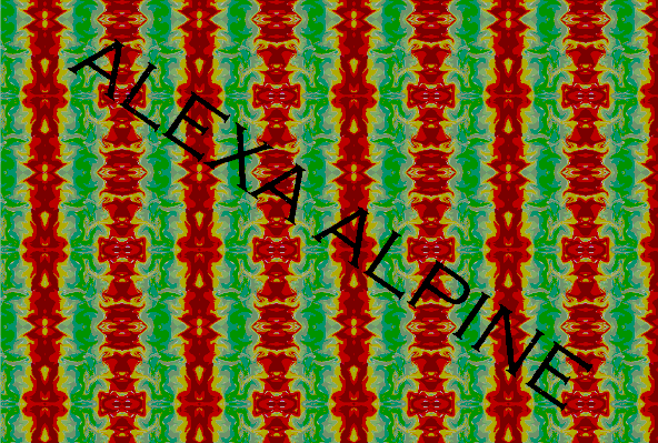
THE MAIN COLOURS THAT CAME THROUGH THE RESEARCH WHERE THAT OF RED AND GREEN/YELLOW. MY initial thought was to combine all of these colour palettes to create an all-in-one print.
I decided not to go through with this print as the theme was Urban Marble and the colour palette had an African flag aesthetic, which is not associated with the theme.
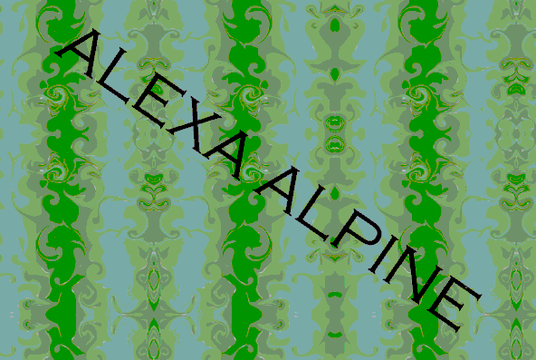
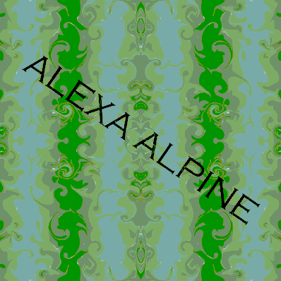
I moved on to creating a print using the green colouring from the trend research. This created a gorgeous affect but I felt it was clear where the edges of the prints start/finish, thus making lines in the print.
I also felt that the colour wasn't as strong as I was hoping for due to the research I have compiled, therefore I decided to go with a stronger colour palette (the red colour palette).
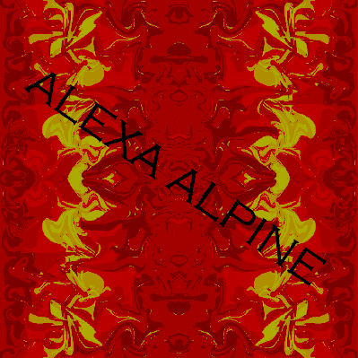

this was the red colour palette and what was what I settled on for the collection of "urban marble".
for further information you can view the urban marble collection and "the book" research, using the buttons below